
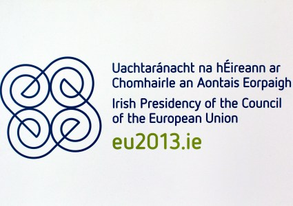
The graphic look for Ireland’s 2013 EU Presidency was put to a vote last year and this month the winning logo was announced with a fair amount of fanfare.
With more than 14,000 online ballots cast on four candidates, voters went with Spirals, the most recognizably Irish of the design.
Maybe voters were looking for a little visual comfort food and a fond glance back to the Ireland of myth and legend, rather than look ahead with the more aspirational options.
Here’s how Spirals was described:
“This logo takes its inspiration from Celtic spirals and knotwork. Taking the letter ‘e’ for Europe as a starting point, the spirals radiate out and are woven together to create a fluid, unified shape. Each member (or ‘e’) is linked and works in harmony with the others, reflecting our ambition to ensure the united and effective operation of the EU under our stewardship.”
The Taoiseach went on the record about the new look:
Minister of State Lucinda Creighton commented on the logo and the opportunities inherent in the EU Presidency, saying “I am delighted that we now have a logo which forms an integral part of part of the development of a visual identity for Ireland’s Presidency.” Labor Party TD Dominic Hannigan said, “I welcome the launch of Ireland's new logo for our Presidency of the EU in 2013. The logo represents the unique energy that Ireland will bring to the six month Presidency.”
As you'd expect, not all the reactions to the winning logo, the four choices or to the idea of having competition to determine the winner were positive. Th logo competition became a focal point for the disgruntled and dissatisfied.
Here's a few of the saltier comments left on the blog BroadSheet.ie:
“As bland and as boring as the EU… perfect!”
“That typeface is horribly, horribly close to being Comic Sans”
“I love the optimism people have about the world making it to 2013”
“..symbolising the bonds of indentured servitude.”
And the voting went like this:
· Spirals 5,250
· Logotype 4,149
· Wave 3,035
· Connections 1,917
· Total 14,351
Connections
Comments